Case Study · 2024
Pro-player income, visualized.
The Objective
A PostgreSQL dump by Aligulac a community-maintained public record of professional StarCraft II results — thirty-five top ranked players, their earnings, nationalities, and race picks, spread across tables that didn't talk to each other in a usable way. The goal was a dashboard someone could actually use, streamers or casters: filter by race, compare earnings, see where the top of the ladder comes from.
Reading the data first
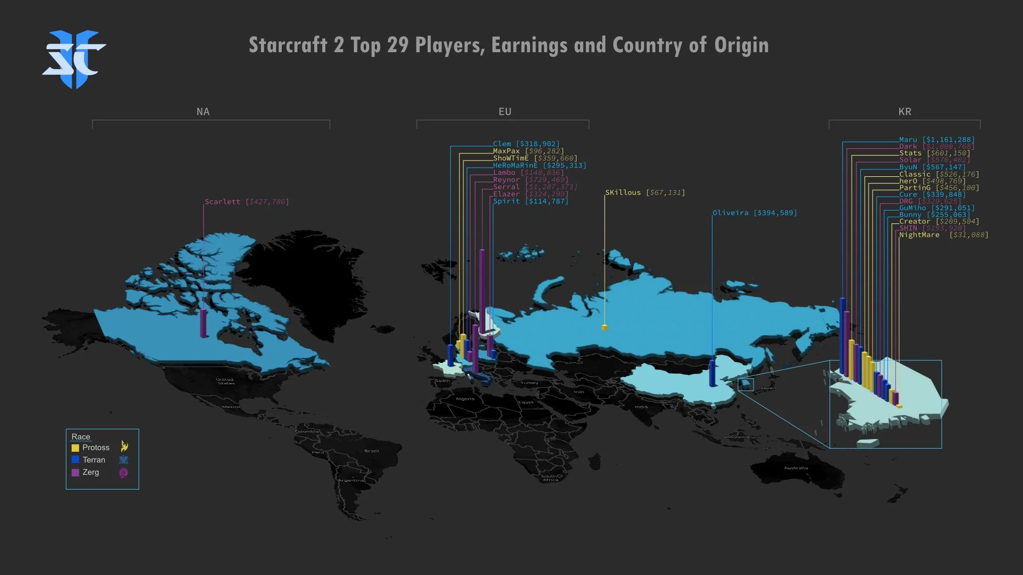
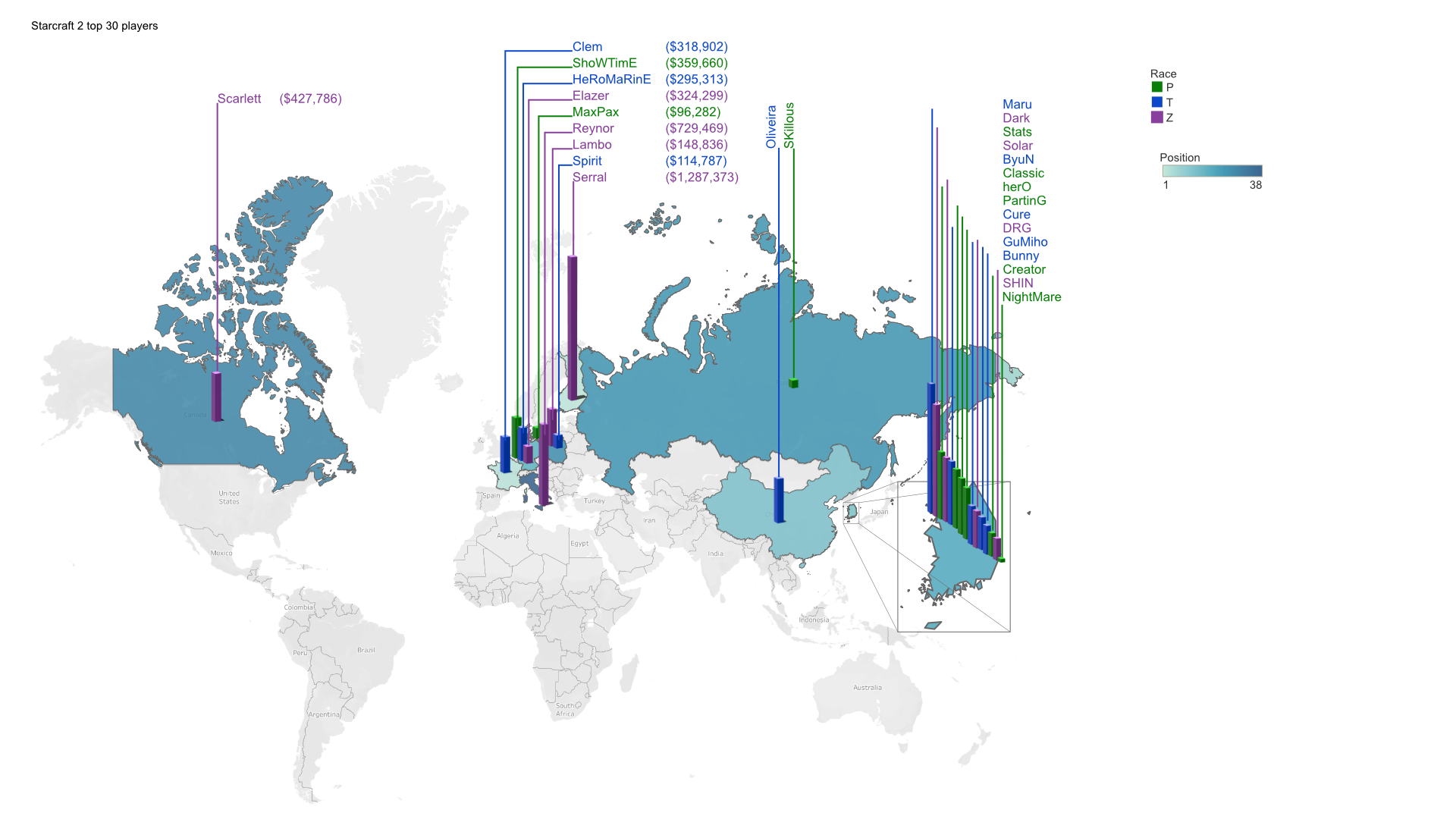
Mapping player nationality looked obvious until the distribution showed up. South Korea holds a disproportionate share of the top ranks with Europe being the second biggest cluster, so any encoding that scaled with volume — bubbles, graduated symbols, stacked markers — collapsed into two dominant blob and told you nothing about the remaining countries. The map got simplified to a flat version and the comparison work moved to the treemap, where thirty-five players can sit side by side at readable size.
The data set the layout
The adaptive header
One header, three states
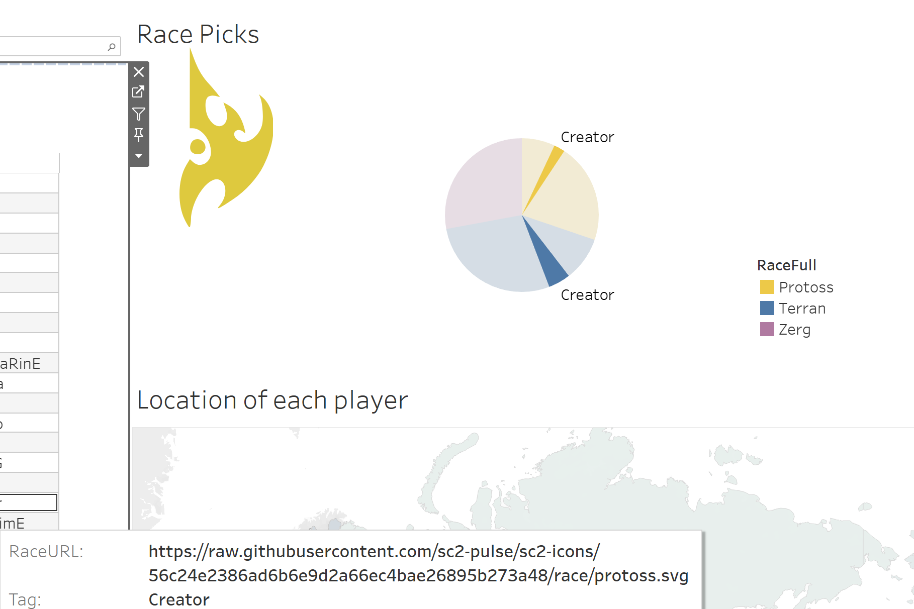
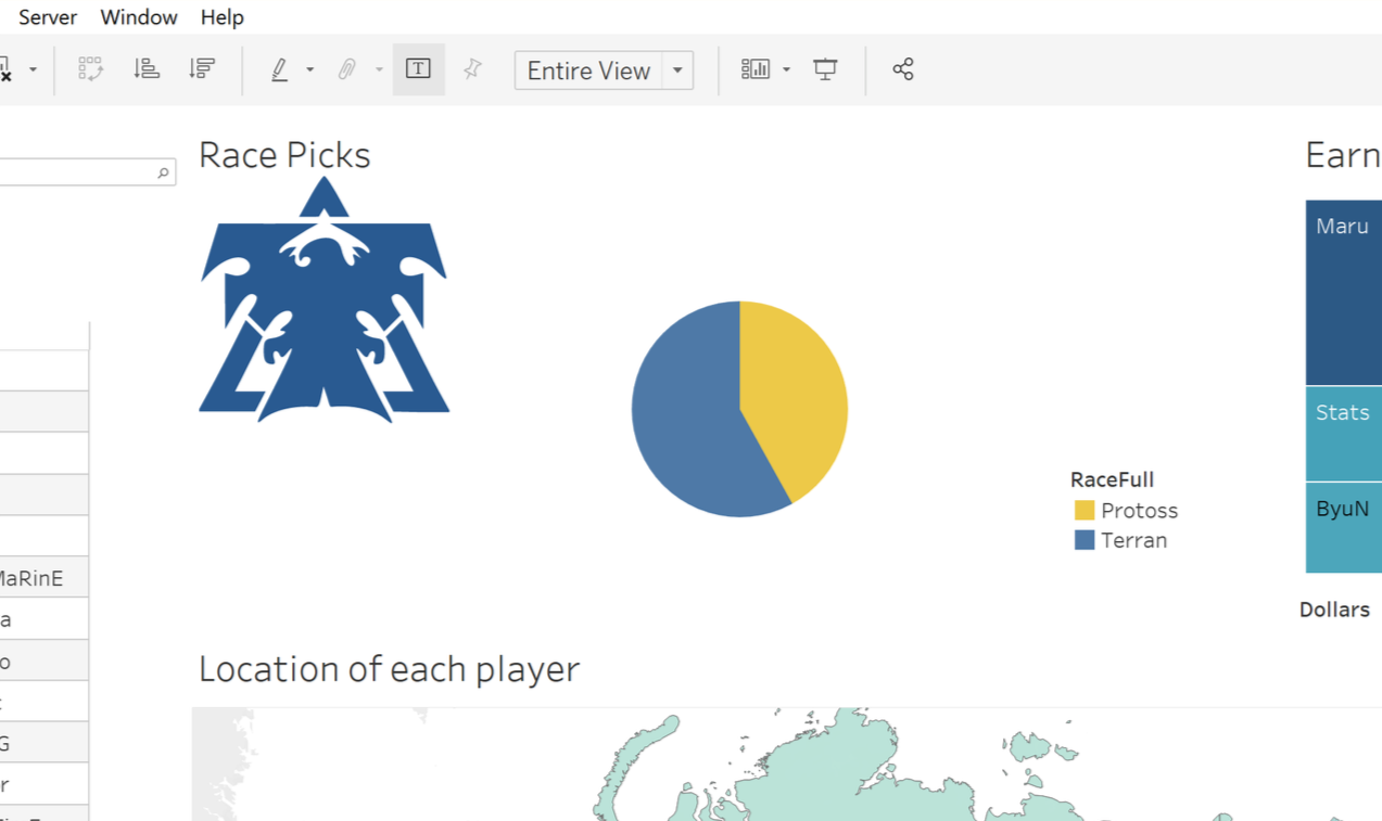
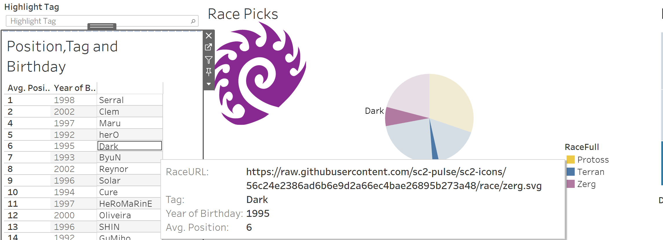
Each race has an in-game icon. The sc2-pulse repository publishes them as SVGs, and the instructor's image viewer could resolve a URL into a rendered asset inside a Tableau tool-tip. So the data carries a RaceURL field, the selection drives it, and the header icon swaps with the filter instead of sitting static. The title does the same thing through a parameter — Race: <Races> resolves to whatever is currently selected.
Working through it
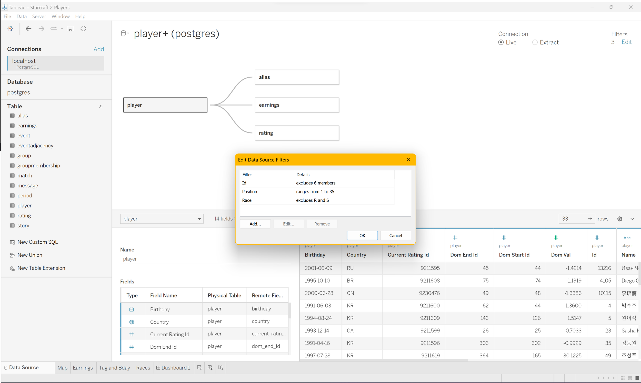
Joining player, earnings, and rating tables
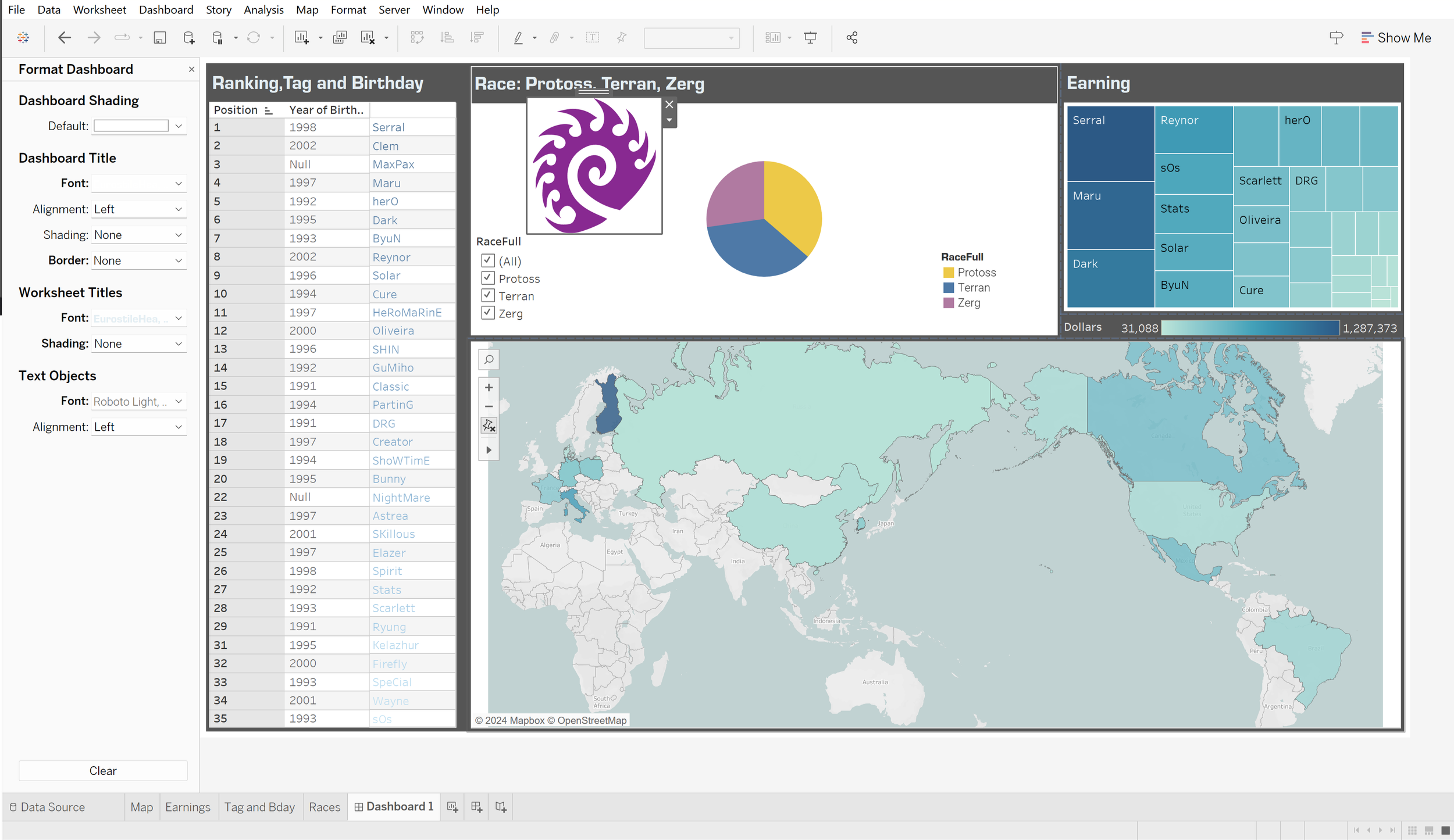
Some of the tableau options for styling and layout boxes
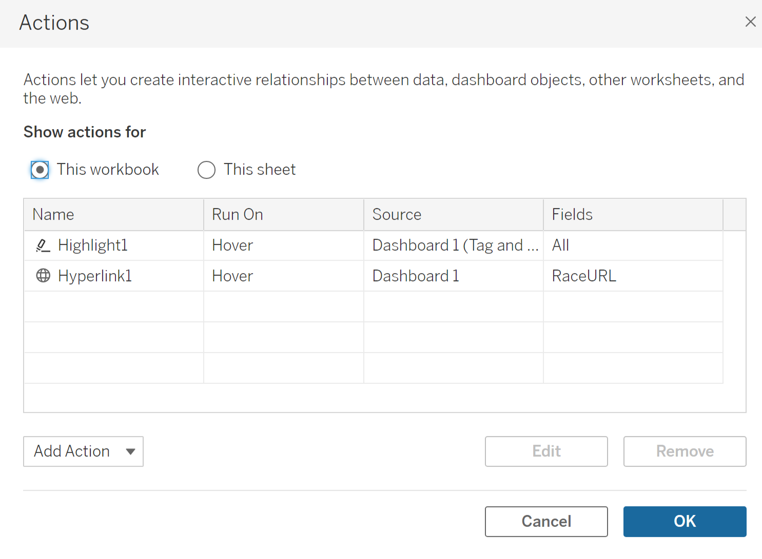
Wiring hover actions to the RaceURL field
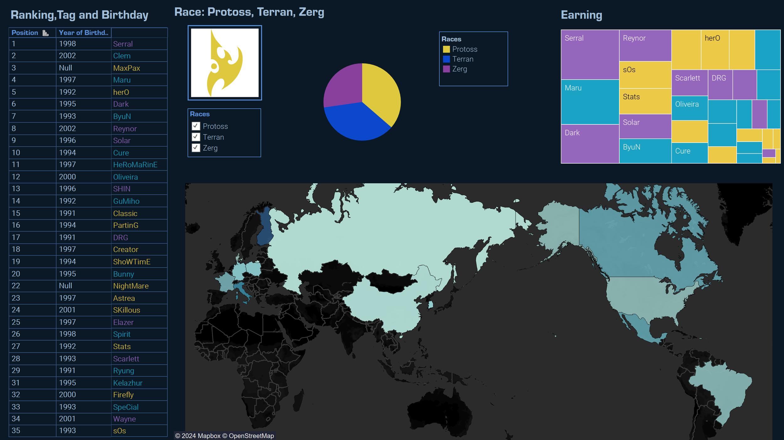
Layout exploration, dark base map
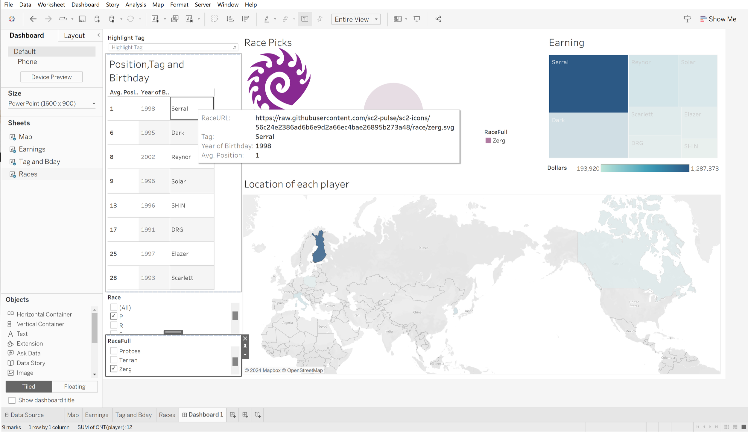
Layout exploration, light base map
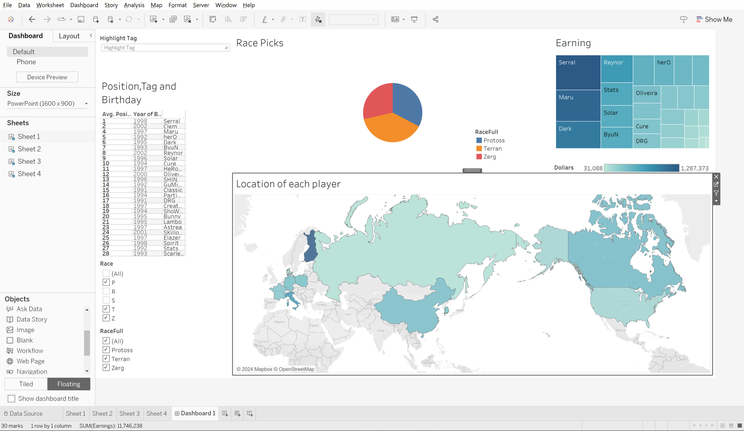
One more layout iteration
What broke
Two things that didn't work
Making the header adaptive introduced a redundancy I didn't catch until late: the word race appears three times inside the same region of the dashboard (the section title, the filter label, and the parameter-driven header). Three repeated labels for one concept, all in the same section creating a bit of a usability and clarity problem.
The second was a better custom multi-value filter built on a parameter action. It almost worked; the true/false states didn't propagate to the <races> value driving the header, so the header would not have changed while the filter said otherwise as well as not actually filtering things by decision, it was a visual improvement but a functional issue. Half-working features are worse than non-working, so it got scrapped.
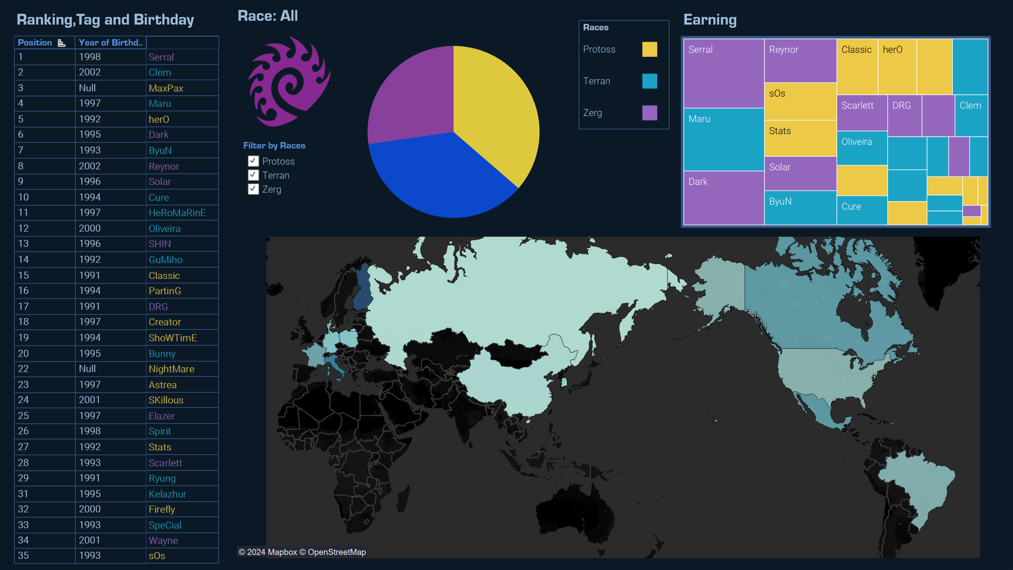
On
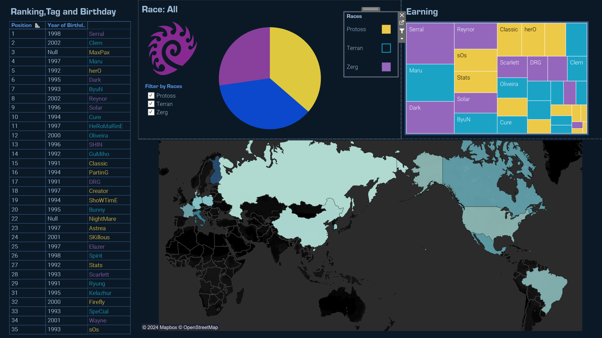
Off (Broken)
The dashboard
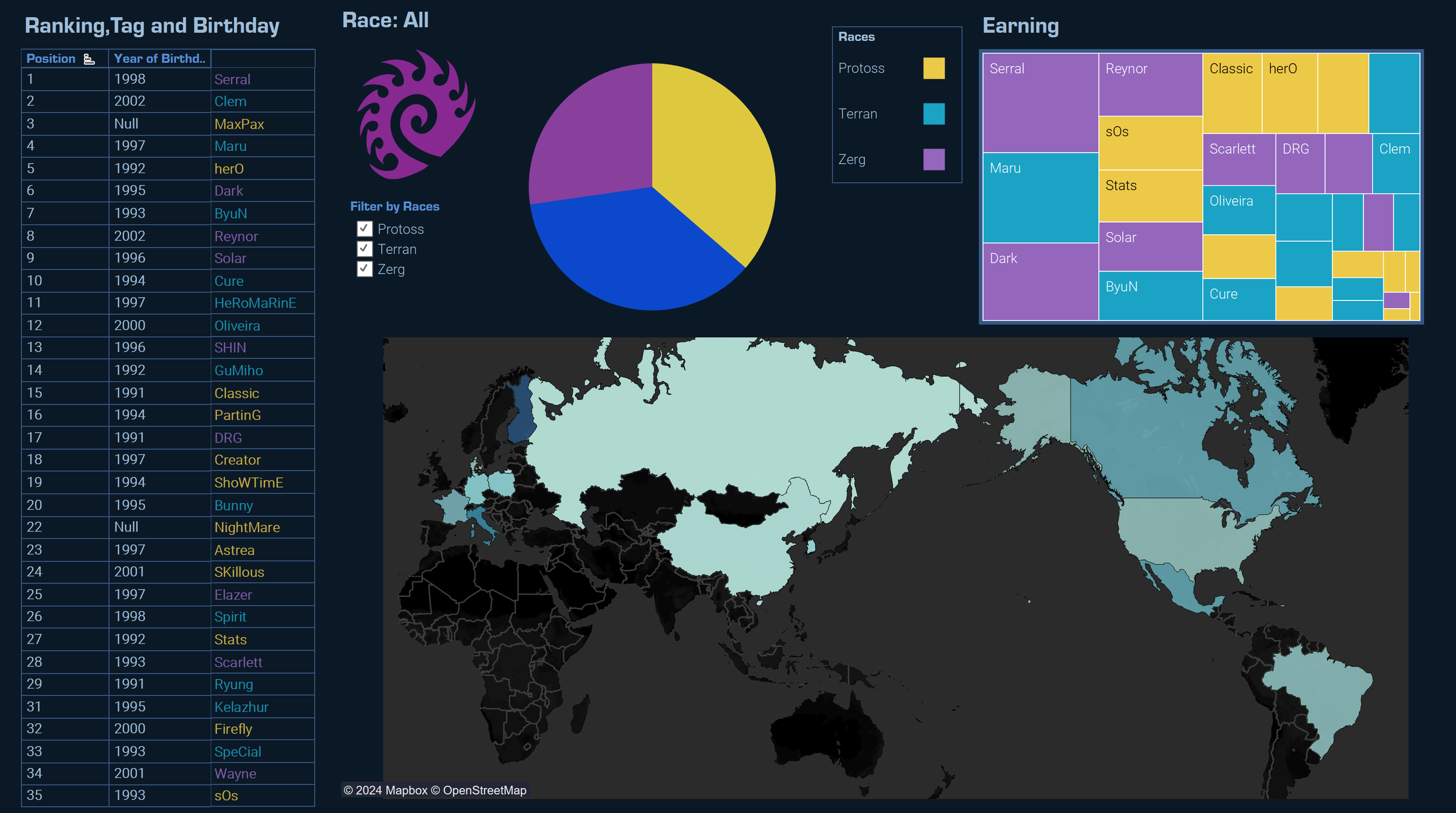
Serral sits first on the ladder and first in earnings by a margin no one else is close to. Three of the top five earners play Zerg. The Earning graph maps both in about a second, which is the point of using this particular visualization. Thirty-five magnitudes, one glance, no further reading required.